


In the Lockdown, I decided to enroll in Data Visualization Nanodegree on Udacity and as a Capstone project, Udacity asked the DVND students to chose any datasets from MakeoverMonday and improve the Dashboard already built using the dataset.
So after looking at the number of datasets, I found the dataset on the Courses offered by Universities in California in the last 110 Years. The data seemed very interesting to me as this can help understand the trend of the Areas being popular over the last 11 decades.
Link To The Data And The Article:
Here is the link to the data:
https://berkeley.app.box.com/v/CoursesBerkeley
Here is the link to the already published Dashboard using this data:
http://uccliometric.org/course-interactive-dashboard/
The reason I chose This Dataset and Dashboard:
When I looked at the Dashboard made using this dataset, I saw multiple scopes of improvement, let me mention them here:
- Pie Chart has been used to show the different courses offered by the Universities. There is a lot of debate on the maximum number of slices to be used in a pie chart. Most experts say 4-6 is good, with 10-12 being the absolute max. If we look at the Dashboard created using this data, there are various slices, so this chart does not make sense here.
- I cannot see a drill-down option provided in the Dashboard. Eg: If Between 1950-2000 I was to find the Area in which the maximum courses were taught, it’s not really possible in the current Dashboard.
Exploring and Assessing The Data:
The data provided is pretty detailed. My goal here was to understand which areas were most popular and if the pattern changed in the last 11 decades. But I did find some data limitations and biases in the data which will affect the insight generation, they are as follows:
Collection:
From the Data Collection point of view, I do not think we have any of the biases while collecting the dataset. Neither the Selection Bias, Response Bias Missing Variables or Survivorship Bias makes sense in this data. As the data has been collated from different Universities and each course offered by the University has to be mentioned in the Dataset. Being a Time Series Data, Survivorship Bias can be one of the biases in such data collection, but the field of studies rarely sees survivorship and as seen from the data, that is not the case.
Processing:
When it comes to Processing Bias, Outlier and Distribution bias does not make a lot of sense here, as in our Dataset we mostly have the name of the courses and as a measure, we are using the count of those courses. But we do have Missingness Bias for the Profs1 and Prof2 column where about 50% of the data is missing. Though these variables have not been used for my analysis.
Insights:
Since I do not see any Bias in the Data Collection stage and the missingness Bias we have in Data Processing stage, those variables are not being used for my analysis, Hence, I do not find any Insights Biases in my data.
Defining The Problem Statement:
Using the dataset I would want to understand the trend of the courses which were being taught over the last 11 decades. This will help me understand how the importance of different fields changed over the last 11 decades.
This is true if Data Science is a trend in 2020, and a lot of people will be enrolling in Data Science courses, the number of courses related to Data Science Engineering being taught by the University will definitely increase. Keeping this hypothesis in mind I want to understand the change of interest and importance of the different fields of study over the last 11 decades.
To answer this hypothesis I will be using a mixture of Tableau Dashboard and Animated Visualization using Flourish.
Dashboard:
The dashboard will help us understand the pattern and the popularity of different areas of study across the last 11 decades and will give us an option to drill down into different areas, fields, and courses.
The animated visualization will also help us understand the change in popularity in a much easier way by looking at the top bars as the year changes.
Here is the Tableau Dashboard, I have built: (Please Maximise the Dashboard For a Better View)
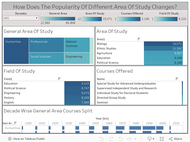
If you look at the Dashboard I have built above, It can clearly be seen how the number of courses offered in different areas changed over the last 11 decades. Also, the TreeMap and the Table Chart do not make the Dashboard too cluttered and give the user an option to drill down from the General Area of Study to different courses offered. Every sheet used in the Dashboard acts as a filter except for the “Decade Wise General Area Courses Split” sheet.
Insights:
It can be seen from the Dashboard that the maximum number of courses offered was in the Humanities Area followed by the Professional Area. Out of 11 decades shown in the graph(not considering the last decade as it only contains 1 year of data), in 9 decades Humanities courses were taught the most, only between 1930-1950 the courses offered in Professional Area were more compared to the Humanities area by the Universities in California, explaining the importance and popularity of Humanities and Professional Courses across the decade.
If we try to drill down into the Humanities Area and look at the specific areas in which the maximum courses were offered, it can be seen that Ethenuc Studies ahs the maximum number of courses, which were almost the double of that of second-most courses offered area in Humanities, which was English.
Again if we drill down further into the Ethenic studies area, we will see that the maximum number of courses were offered in Near Eastern Studies, South and Southeast Asian Studies, and East Europian studies fields, which can further be drilled down to look at all the offered courses in this field.
Animated Graph To Understand The Change In Engineering Courses Trend Across 11 Decades:
I also wanted to understand, how the importance and popularity of different areas and fields of engineering changed over the last 11 decades and hence I made an animated visualization using Flourish. Here is what it looks like:
Insights:
- Initially, between 1900-1925, the only Engineering courses offered were Civil, Mechanical, Mining Engineering, and Engineering Design. In the decade 1900-1910, Civil Engineering was more popular followed by Mining. But since 1914, the year when the First World War started, Universities in California started offering more Mechanical Engineering courses and it made sense.
- Mechanical Engineering remained popular till 1930 but then Mining Engineering gained more popularity, though by 1940 again the Mechanical Engineering became the area with maximum offered courses in. It remained popular till 1945, then Electrical Engineering courses were offered the most.
- Electrical Engineering courses were started in 1925 by Universities in California and it always remained in the top 10 areas of maximum offered courses.
- Though courses in Engineering Design were always in the top 10. It is the oldest field, starting from 1900, since 2000, Engineering Design had a lot of courses offered, but then in the last 1 decade, other engineering courses especially Research and Thermodynamics courses were offered the most, which were categorized in the Others.
Why My Dashboard is better?
- The charts used in the Dashboard are much easier to read and understand and are not cluttered like the one used in this Dashboard.
- The Dashboard is more interactive and gives a better Drill Down option using the drop-down and sheet level filters offered to the user compared to the previously built Dashboard.
- This Dashboard also lets the user compare different Areas across time using the multiple selection feature of the decades compared to the previously built Dashboard.
- Also, this Dashboard is more cleanly laid out.