


NOTE: If you are looking forward to enrolling in Data Visualization Nondegree on Udacity or any other Nanodegree Program, you can click on this link to get $50 off.
The COVID-19 has affected the whole world, while some brave corona warriors like doctors, security forces, media, sanitation workers, delivery personnel, bank employees, government employees, and local store owners are doing their job, We have our responsibility towards the community of staying indoors and maintaining social distance. Our personal responsibility is also to keep learning during this period for our growth.
During this period, a lot of Online course platforms like Udacity, Coursera, Pluralsight, Tableau Learning, etc have come up with various offers, which seems like a win-win situation for the students and the platform both.
Being a Data Science Consultant, recently I have been working on Data Visualization projects, because of the client’s requirement. I had an intermediate knowledge of Tableau and wanted to get my expertise in it, so I decided to enroll in Data Visualization Nanodegree on Udacity.
It is quiet easy to understand from my previous articles that I am fond of courses on Udacity and the main reason behind that is small and informative videos and practical projects, which makes you industry ready.
Summary Feedback
- The course is exhaustive, almost everything has been covered in the course which any 2-4 year experienced Data Visualization Expert would have used.
- You will have to complete 10 projects in order to pass the Nanodegree, out of which, 8 are Data Visualization related projects and 2 are Career Services related projects which include improving your resume and LinkedIn profile.
- The 8 projects include multiple types of Dashboards like Static Dashboard, Dynamic Dashboard, and Animated Dashboard. Animated Dashboards are so cool and you might have seen something similar being shared by so many people these days. Please check out the animated DB at the end of this article, here.
- Overall the course is amazing, exhaustive, suitable for someone with intermediate knowledge of Tableau or for the complete beginner as well, and should take around 2-3 months to complete.
Detailed Review
COURSE: Data Visualization Nanodegree
PREREQUISITES: Basic Data Analysis (Even if you don’t have any prior experience in Data Analysis, you should be good.)
COURSE FEES: $399 per/month OR ₹22,849 per/month (You can contact me for special discounts, or use the extra $50 off coupon over any currently running offers)
There are total 7 chapters in the Nanodegree:
- Welcome To The Nanodegree Program
- Introduction to Data Visualization
- Dashboard Design
- Data Storytelling
- Advanced Data Storytelling
- Career Services
- Capstone
1. Welcome to the Nanodegree Program
This is just an introduction chapter, where you have four lessons:
1. Welcome to the Data Visualization Nanodegree Program: Not much, just a few welcome videos.
2. Knowledge, Community, and Careers: Udacity has 3 unique offerings that are not provided by most other online course platforms. These platforms are:
Knowledge: It is a forum where you can ask any question, related to the course or technical issues which are directly assigned to the mentors working with Udacity, mentors get paid for each answer, which means a quick solution is provided to the students. There might be a case that the question is assigned to a mentor and the mentor is not available to answer, in such a case, the question gets reassigned to another mentor in an hour. Along with mentors, peer students also reply to the questions posted by their colleagues.
Careers: Again this is something very unique from Udacity. They help the students optimize their LinkedIn profile and Resume according to the role students are interested in after the completion of the course. This service includes getting your LinkedIn profile and resumes checked by the Career Coaches and feedback from them, it also included a 1-on-1 session with carer coaches, which can be availed once during the program.
3. Get Help with your Account: This lesson basically explains how you can get answers to the questions you have related to your account or general questions about the program.
4. Introduction to Data Visualization Nanodegree Program: This lesson explains the structure of the Nanodegree program.
2. Introduction to Data Visualization
This chapter also contains four lessons and gives an overview of Data Visualization, Design Principles, Creating Visualizations in Tableau, and Telling Stories with Tableau.
The very first project is the BUILD DATA DASHBOARD, where we are provided with Flight delays data from Kaggle and we need to develop a Tableau Dashboard using the Dataset and create a Report using the insights from the Dashboard.
3. Dashboard Design
There is a total of 2 projects in this chapter:
1. Design a Data Dashboard Midterm Project
2. Design a Data Dashboard Final Project
The first two lessons in the chapter are the Planning Phase and the Designing phase after which comes the very second project of the ND, and the first projects of the chapter, Design a Data Dashboard where we are required to create a wireframe for the dashboard.
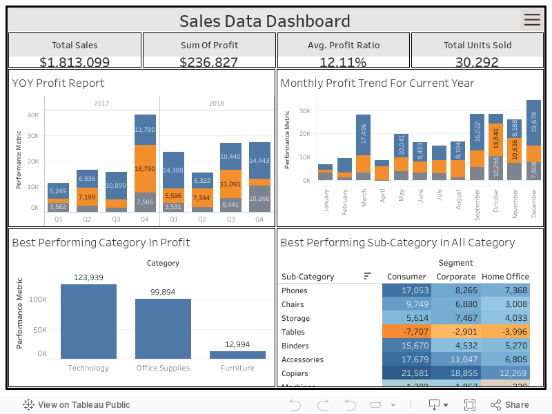
Once the Wireframe for our dashboard is complete, then comes the Polishing Dashboard for Production lesson, where we learn how to make our dashboard production-ready and in the final project for the chapter, Design a Data Dashboard, we polish our dashboard and publish it to tableau public.
Here is a look at my Final Dashboard:
*** Please view in Fullscreen for the best results.
4. Data Storytelling
This chapter also contains 2 projects:
1. Build a Data Story Midterm Project
2. Build a Data Story Final Project.
The first two lessons in Chapter 4 focus on Defining the Problem Statement and Issue Trees/Building a Ghost Deck, meaning to understand the problem statement and creating a workflow of reaching the solution. After the two lessons comes the Data Story Midterm Project.
After this, there are two more lessons in the chapter, Limitations and Boases and Visualizations and tying it Together. There can be different types of Biases like Data Collection Bias (Selection Bias, Response Bias, etc), Data Processing Bias (Outliers, Missingness Understanding, etc), and Data Insights Bias (Confirmation Bias, Overfitting/Underfitting Bias), etc.
*** There were a lot of new and technical things that I learned in this lesson and never heard of before.
5. Advanced Data Storytelling
The advanced Data Storytelling contains topics like how to use Tableau to present a story to the user, types of Data Story, and which one should be selected in what scenario.
There are two projects in this chapter:
1. Animate a Data Story Midterm Project
2. Animate a Data Story Final Project
The first two lessons of the chapter talk about Eight Data Story Types and Creating stories in Tableau. After completing the two lesson we submit the Midterm Project.
The second part is the one which I enjoyed the most as in the second part we learn to animate the visualizations. We use the Flourish app to do so. Once done with Animations lessons we had to complete the Final Project.
Here is my final project: (It could have been much better, but I had time constraint)
6. Career Services
As mentioned above, the career service helped me with two things:
1. Optimize My Resume according to the job I am or I will be looking for in the future.
2. Optimize My LinkedIn Profile according to the job I am or I will be looking for in the future.
7. Capstone Project
This is a bit challenging part of the Nanodegree but interesting too. In this project, you are required to select any dataset from MakeOverMonday, check the Visualization provided using that data and our job is to make that visualization better. We can make it better by creating a Dashboard, or a Story on Tableau or Flourish. And once done with this part, you need to write an article on Medium or personal blog explaining how your visualization is better than the one provided on MakeOverMonday.
Here is my article for the Capstone project:
http://inquisitiveone.in/datascience/datasetanalysis/different-field-of-studies-offer-by-california-universities-in-last-110-years/
I hope you will like this and this might be helpful for you if you are planning to enroll in Data Visualization Nanodegree yourself.
Phewwwww. So, after completing all this finally I was able to receive the certification for my hard work.
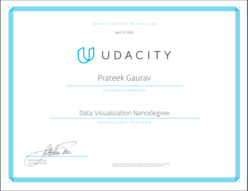
Overall, it was a good experience. A lot of learning, good community and mentor support and finally a certificate.
So, if you wanted clarity on whether to enroll in this course or not, I believe the detailed explanation would help you reach to the conclusion. Also, if you are reading the article in the lockdown, Udacity is currently offering one-month free access to everyone, so indeed its a good time to enroll and explore the course for yourself.